3/22/2008
One of the most overlooked aspects of climate change is land use changes. In my last blog I talked about rain forests and how their destruction adversely affected our climate. Deforestation is just one aspect of land use change that contributes to climate change, there are many more that also have an under-appreciated influence on climate. With all the miss-guided focus on CO2 as the big boogey man, many other man made influences are ignored or given far too little attention. Probably the most well known of all land use changes on global warming is the Urban Heat Island, (UHI).
UHI is relatively easy for anyone to understand and grasp. When you build a town, city or metropolis on land, which once were prairie, swamp, forest or some other natural landscape, it is bound to change the local and surrounding environment including the climate. Mostly we see it as temperature changes, obviously pavement and buildings not to mention car and industrial exhaust are going to generate more heat than grassland, trees and antelope. The EPA explains it very simply
>Heat islands form as vegetation is replaced by asphalt and concrete for roads, buildings, and other structures necessary to accommodate growing populations. These surfaces absorb - rather than reflect - the sun's heat, causing surface temperatures and overall ambient temperatures to rise.
There are other affects of the UHI, studies have shown that monthly rainfall is about 28% greater between 20-40 miles downwind of cities, compared with upwind. (Fuchs, Dale 2005)
Although much debated the IPCC states that the UHI actually has a minuscule affect on global temperatures. They say the overall affect of the UHI on global temperatures since 1900 has been .002 degC per decade (Fourth Assessment Report of IPCC 2007: p.244). As I said this is debated the paper, "Should light wind and windy nights have the same temperature trends at individual levels even if the boundary layer averaged heat content change is the same?" as an example.
Regardless it is probable that the UHI has no overall significant impact on global temperatures, remembering that oceans which are not known for urbanization account for 70 % of the earths surface area, and urban areas only account for about 1.5% of the entire earth surface.
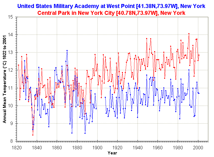
Having said all that, when you measure global temperatures, where are the thermometers?

source
The above is a very obvious and easy to see historical representation of the UHI affect on temperature records. Which of these do you believe is a more accurate historical record of temperatures? If you were responsible for determining what the earth's temperature was doing what would you do with the above records?
Much of what my next several blogs are going to be drawn from some excellent web-sites, which I encourage anyone interested to visit. They are Coyote Blog dispatches from a small buisness,-Surface Station.org,-Watts Up With That?,- Climate Audit All of these are excellent sites, very informative and often amusing.
The following is from Coyote Blog
==========================================================================
Let's say you had two compasses to help you find north, but the compasses are reading incorrectly. After some investigation, you find that one of the compasses is located next to a strong magnet, which you have good reason to believe is strongly biasing that compass's readings. In response, would you
1. Average the results of the two compasses and use this mean to guide you, or
2. Ignore the output of the poorly sited compass and rely solely on the other unbiased compass?
Most of us would quite rationally choose #2. However, Steve McIntyre shows us a situation involving two temperature stations in the USHCN network in which government researchers apparently have gone with solution #1. Here is the situation:
He compares the USHCN station at the Grand Canyon (which appears to be a good rural setting) with the Tucson USHCN station I documented here, located in a parking lot in the center of a rapidly growing million person city. Unsurprisingly, the Tucson data shows lots of warming and the Grand Canyon data shows none. So how might you correct Tucson and the Grand Canyon data, assuming they should be seeing about the same amount of warming? Would you average them, effectively adjusting the two temperature readings towards each other, or would you assume the Grand Canyon data is cleaner with fewer biases and adjust Tucson only? Is there anyone who would not choose the second option, as with the compasses?
The GISS data set, created by the Goddard Center of NASA, takes the USHCN data set and somehow uses nearby stations to correct for anomalous stations. I say somehow, because, incredibly, these government scientists, whose research is funded by taxpayers and is being used to make major policy decisions, refuse to release their algorithms or methodology details publicly. They keep it all secret! Their adjustments are a big black box that none of us are allowed to look into (and remember, these adjustments account for the vast majority of reported warming in the last century).
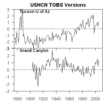
We can, however, reverse engineer some of these adjustments, and McIntyre does. What he finds is that the GISS appears to be averaging the good and bad compass, rather than throwing out or adjusting only the biased reading. You can see this below. First, here are the USHCN data for these two stations with only the Time of Observation adjustment made (more on what these adjustments are in this article).

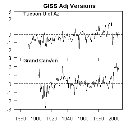
As I said above, no real surprise - little warming out in undeveloped nature, lots of warming in a large and rapidly growing modern city. Now, here is the same data after the GISS has adjusted it:

You can see that Tucson has been adjusted down a degree or two, but Grand Canyon has been adjusted up a degree or two (with the earlier mid-century spike adjusted down). OK, so it makes sense that Tucson has been adjusted down, though there is a very good argument to be made that it should be been adjusted down more, say by at least 3 degrees**. But why does the Grand Canyon need to be adjusted up by about a degree and a half? What is biasing it colder by 1.5 degrees, which is a lot? The answer: Nothing. The explanation: Obviously, the GISS is doing some sort of averaging, which is bringing the Grand Canyon and Tucson from each end closer to a mean.
This is clearly wrong, like averaging the two compasses. You don't average a measurement known to be of good quality with one known to be biased. The Grand Canyon should be held about the same, and Tucson adjusted down even more toward it, or else thrown out. Lets look at two cases. In one, we will use the GISS approach to combine these two stations-- this adds 1.5 degrees to GC and subtracts 1.5 degrees from Tucson. In the second, we will take an approach that applies all the adjustment to just the biases (Tucson station) -- this would add 0 degrees to GC and subtract 3 degrees from Tucson. The first approach, used by the GISS, results in a mean warming in these two stations that is 1.5 degrees higher than the more logical second approach. No wonder the GISS produces the highest historical global warming estimates of any source!
===============================================================
Perhaps if you have read this and followed it closely, you can see why skeptics are skeptical, lol. If you were also aware of the fact that the scientist, James Hansen, is in charge of GISS is perhaps the world's strongest proponent of the enhanced greenhouse gas theory, it should raise questions. As many of us believe, man made global warming may be more man made than you think.
"Humanity today, collectively, must face the uncomfortable fact that industrial civilization itself has become the principal driver of global climate. If we stay our present course, using fossil fuels to feed a growing appetite for energy-intensive life styles, we will soon leave the climate of the Holocene, the world of human history. The eventual response to doubling pre-industrial atmospheric CO2 likely would be a nearly ice-free planet.
The stakes, for all life on the planet, surpass those of any previous crisis. The greatest danger is continued ignorance and denial, which could make tragic consequences unavoidable."
The Reverend...Uh, I mean Dr. James Hansen
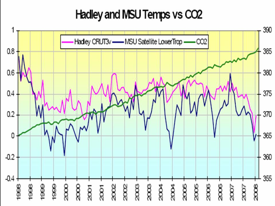
Meanwhile in reality

Recently someone commented on the above graph saying that it started at an obvious outlier year of 1998. True so for your viewing pleasure I'll also post these.

and the longer view.
Note graph at top of page is update from Climate Skeptic
Thanks
No comments:
Post a Comment